
꺼내먹는지식 준
Matplotlib Facet (figure 위치 바꾸기) 본문
1. 배경색 조정 가능
fig, ax = plt.subplots()
fig.set_facecolor('lightgray')
plt.show()
2. ShareX ShareY 즉, x,y 축 통일 가능
fig = plt.figure()
ax1 = fig.add_subplot(121)
ax1.plot([1, 2, 3], [1, 4, 9])
ax2 = fig.add_subplot(122, sharey=ax1)
ax2.plot([1, 2, 3], [1, 2, 3])
plt.show()


#fig, axes = plt.subplots(1, 2, sharey=True) 애초에 이렇게 선언도 가능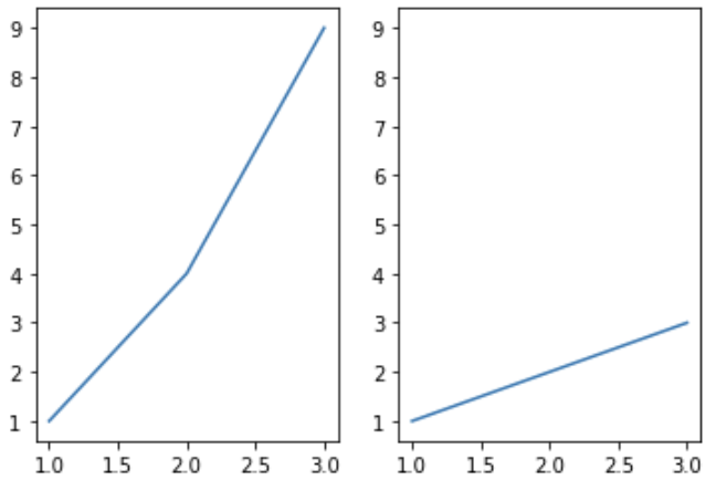
3. 다른 글에서 flatten으로 axes 접근을 1D 로 할 수 있다고 했는데 squeeze로 반대 조정이 가능
즉, 항상 2D 차원으로 배열 받기 가능
n, m = 1, 3

fig, axes = plt.subplots(n, m, squeeze=False, figsize=(m*2, n*2))
idx = 0
for i in range(n):
    for j in range(m):
        axes[i][j].set_title(idx)
        axes[i][j].set_xticks([])
        axes[i][j].set_yticks([])
        idx+=1

plt.show()
4. 가로 세로 비율 조정 가능
fig = plt.figure(figsize=(12, 5))
ax1 = fig.add_subplot(121, aspect=1)
ax2 = fig.add_subplot(122, aspect=0.5)
plt.show()
5. N $\times$ M 그리드에서 슬라이싱으로 서브 플롯을 배치하는 것이 가능하다.
fig = plt.figure(figsize=(8, 5))

gs = fig.add_gridspec(3, 3) # make 3 by 3 grid (row, col)

ax = [None for _ in range(5)]

ax[0] = fig.add_subplot(gs[0, :])
ax[0].set_title('gs[0, :]')

ax[1] = fig.add_subplot(gs[1, :-1])
ax[1].set_title('gs[1, :-1]')

ax[2] = fig.add_subplot(gs[1:, -1])
ax[2].set_title('gs[1:, -1]')

ax[3] = fig.add_subplot(gs[-1, 0])
ax[3].set_title('gs[-1, 0]')

ax[4] = fig.add_subplot(gs[-1, -2])
ax[4].set_title('gs[-1, -2]')

for ix in range(5):
    ax[ix].set_xticks([])
    ax[ix].set_yticks([])

plt.tight_layout()
plt.show()
즉 원하는 위치에 배치 가능!

6. 특정 위치에 그래프 위치 조정 하여 그리는 것도 가능은 하나 어렵다.
fig = plt.figure(figsize=(8, 5))

ax = [None for _ in range(3)]


ax[0] = fig.add_axes([0.1,0.1,0.8,0.4]) # x, y, dx, dy
ax[1] = fig.add_axes([0.15,0.6,0.25,0.6])
ax[2] = fig.add_axes([0.5,0.6,0.4,0.3])

for ix in range(3):
    ax[ix].set_title('ax[{}]'.format(ix))
    ax[ix].set_xticks([])
    ax[ix].set_yticks([])

plt.show()
7. sub plot 추가
fig, ax = plt.subplots()

color=['royalblue', 'tomato']
ax.bar(['A', 'B'], [1, 2],
       color=color
      )

ax.margins(0.2)
axin = ax.inset_axes([0.8, 0.8, 0.2, 0.2])
axin.pie([1, 2], colors=color,
         autopct='%1.0f%%')
plt.show()
이런게 가능.
8. axes 옆에 추가 다만 기존 axes 크기는 줄어든다.
주로 다음과 같이 color map 추가할 때 많이 사용
fig, ax = plt.subplots(1, 1)

# 이미지를 보여주는 시각화
# 2D 배열을 색으로 보여줌
im = ax.imshow(np.arange(100).reshape((10, 10)))

divider = make_axes_locatable(ax)
cax = divider.append_axes("right", size="5%", pad=0.05)

fig.colorbar(im, cax=cax)
plt.show()
'CS > 데이터시각화' 카테고리의 다른 글
| Seaborn 이란? (0) | 2022.02.12 |
|---|---|
| Matplotlib Text Visualization (0) | 2022.02.07 |
| Matplotlib Color (0) | 2022.02.07 |
| Matplotlib 기본기에서 벗어나는 몇가지 팁 (0) | 2022.02.07 |
| Matplotlib Scatter Plot (0) | 2022.02.04 |
'CS/데이터시각화' Related Articles
more


Comments